
Game analytics · Part 03 of 8 · August 24, 2026
Running the Whole Chain: What a Revenue Forecast Is For
Written to a disclosure policy: errors, rankings, biases and coverage are reported as measured; totals, prices and dates finer than a year are withheld, and the two titles are pseudonyms. Every figure traces to a named table, listed at the end.
The question
By the time I got here, every stage of the forecast had been validated on its own. Cost-per-install had a champion. Paid and organic installs had theirs. Each cohort-age metric — active users, monetising users, paying users, revenue — had been through a bake-off and had a selected specification. None of that answered the question a studio would actually ask, which is what happens when you run them in series and add the result up.
Total monthly revenue is the sum over every cohort alive in that month of what that cohort earns at its current age. Some of those cohorts have two years of history. Some were acquired last month. Some do not exist yet and will be bought with next quarter’s budget. A composed forecast has to age the first group, extend the second, and invent the third from the UA plan. Errors in each can compound, or cancel, or do something less tidy.
What I wanted to know was whether the composition forecast revenue better than the things a studio does in a spreadsheet, and whether it could call the turns.
Why a game’s revenue is harder to observe than it looks
The observed data is a triangle. Lay the cohorts out as rows, ordered by install month, and cohort age as columns: the oldest cohort has every age filled in, the newest has one cell, and the boundary between observed and unobserved runs on a diagonal. Every cohort will eventually trace out the same general shape — a steep fall in the first months, then a long, slowly eroding tail — but at the moment you have to decide, only the old ones have drawn theirs.
Four clocks are running at once, and confusing them is how I made at least one mistake in earlier drafts of this work. Install month says which cohort. Cohort age says how far along its curve it is. The origin is where the forecaster is standing — the last month whose actuals are known. The horizon is how far past the origin the forecast reaches. A cohort acquired six months before the origin is at age six; forecast twelve months ahead, it will be at age eighteen, and the evidence for what it does at eighteen comes from cohorts that had already reached eighteen when the forecast was made. Nothing else is legitimately visible.
Then there is the question of what the forecast is for, which I had been answering wrongly by default. My own practice, before this study, was to fit a revenue baseline on a hand-picked run of preceding months — excluding the promotion months, the months a retention change landed, the obvious shocks — and then hand the studio a plan for beating it. A monthly revenue forecast, in that practice, is not a bet on what will happen. It is a statement of where the game goes if nothing changes, and the live-ops calendar and the UA plan are written against it. Their job is to beat it. A baseline that gets beaten is not a broken forecast; it is a plan that worked.
That framing matters for how the thing should be judged, and I will come back to it, because it turned out to interact with a modelling choice in a way I did not anticipate.
My approach
At each of forty monthly origins, the composition runs every stage in series
and scores total calendar revenue one, three, six and twelve months out
(revenue_chain__revenue_chain_accuracy).
Existing cohorts are aged forward on curves learned from older cohorts. The curve model estimates, for each age n, a rate from the sequence of prior cohorts’ values at that age, and the choice of what to estimate — the basis — is the decision that dominated everything else:
survival:  s(n) = v(n) / v(0)      forecast  v(n) = v(0) · ŝ(n)
decay:     d(n) = v(n) / v(n−1)    forecast  v(n) = v(n−1) · d̂(n)
Survival re-anchors every forecast on the cohort’s first month and takes the whole shape from prior cohorts. Decay chains from the most recent observation. I will say more about why this matters below, because it is where the study’s most consequential bug lived.
New cohorts — acquired after the origin — have no history at all. They are sized by the UA chain (spend known, structural CPI, paid installs, organic k-factor) and valued from a revenue-per-install level at each age taken from prior cohorts. Keeping them separate from existing cohorts is not tidiness; they fail differently and carry different shares of the error at different horizons.
Past a certain age no prior cohort has reached that age, so no per-age rate can be estimated. Left alone those cohorts forecast to nothing and their revenue silently disappears — and deep cohorts carry a meaningful share of the total. So past a core age every cohort shares one pooled month-over-month rate.
The chain has to beat something honest. Four baselines skip it entirely: the last month held flat, a log-linear drift through the last twelve months, the same month last year, and the mean of the last three. The drift line is the bar that matters; it is what a studio would actually do.
Each variant of the chain changes exactly one thing, so its contribution can be measured rather than argued: feed actual post-origin install counts instead of forecast ones; forecast users and revenue-per-user separately and multiply; switch the pooled tail off; switch each correction off.
The assumptions doing the heavy lifting
Spend is known. The studio controls its budget. The composition’s job is to say what that budget buys, not to guess it.
Revenue is forecast directly, not as users × revenue-per-user. This was a
measured decision, not a preference. In the stage bake-off, counts of people
forecast well — paying users at 0.164 mean MAPE, monetising users 0.224, active
users 0.26 — and cohort revenue is harder, at 0.559. But revenue per monetising
user sits at 0.902, effectively unforecastable
(revenue_chain__stage_model_bakeoff). It is a small ratio of two noisy
quantities, driven by pricing, offers and whale behaviour that no cohort curve
can see. Multiplying a good error by a terrible one is worse than accepting a
mediocre one. The decomposed route is kept as a scored variant and it loses.
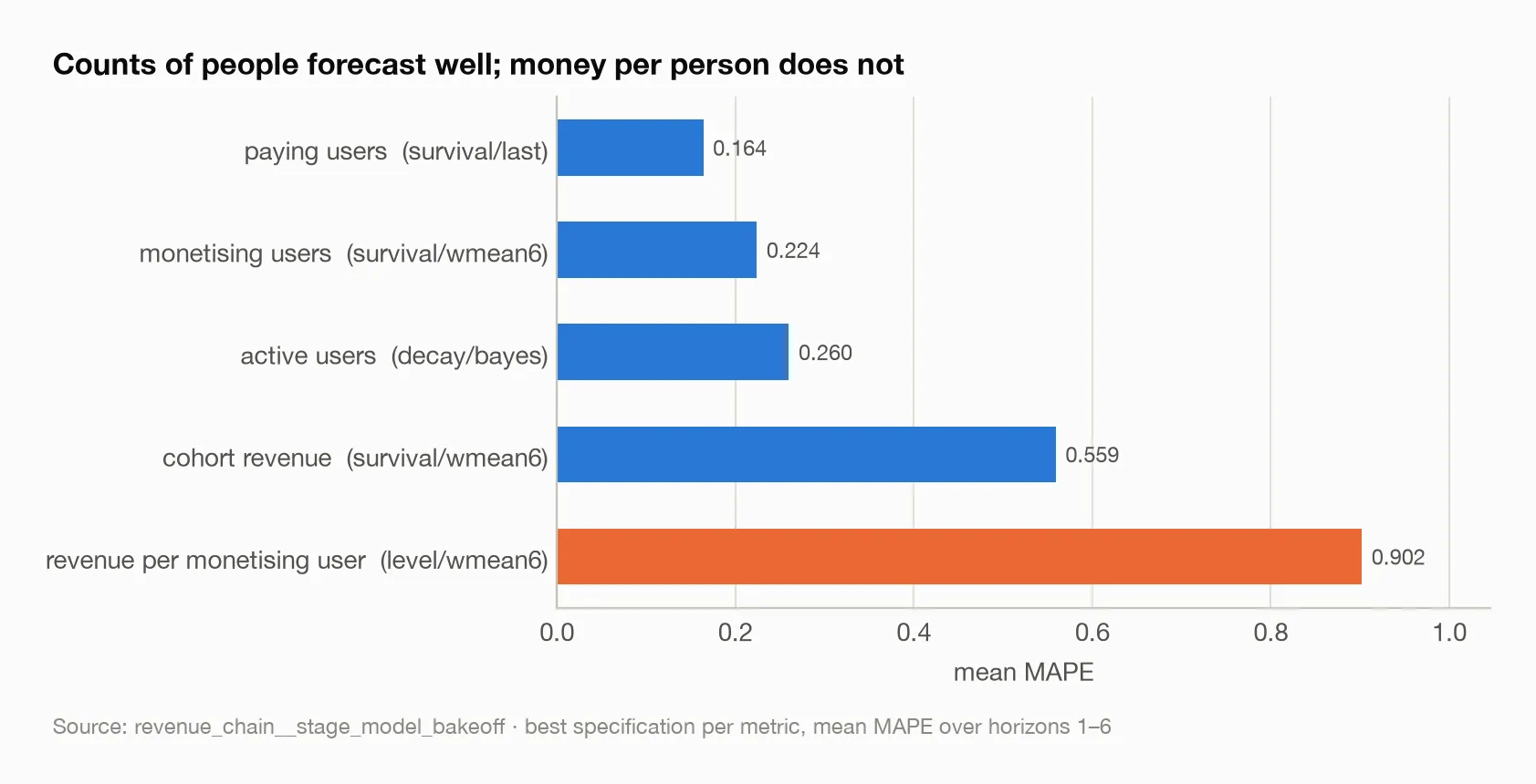
Each bar is the best specification found for that metric. The ordering is the design decision: revenue is composed from cohort revenue directly, because the orange bar is what happens when you try to forecast the per-user ratio.
The observability rule. A prior cohort informs age n only if it had reached age n on or before the origin. Because the constraint is a triangle rather than a date cutoff, it is easy to get wrong and the failure is invisible: the model simply looks better than it is. Every number here respects it.
The forecast is a baseline. Scoring it against realised revenue, pooled,
measures the shocks it never claimed to see plus the effects of whatever the
team did in response. The narrower question is whether, in windows where the
things a studio controls went as planned, it maps the trajectory. I split the
same forecasts by whether the window contained a month that moved more than a
threshold share, and swept the threshold rather than picking one
(revenue_chain__baseline_conditional_accuracy).
Where reality became inconvenient
The composition was running a model the study did not think it was running. This is the finding I am least comfortable with and the one I most need to report. The function that aged cohorts and added the pooled tail hardcoded a decay basis and ignored the basis the specification named. The bake-off could select survival, print survival, and publish survival while the composition quietly chained decay. Every composed result was measured on the wrong model.
Fixing it inverted the chain’s horizon profile. Under decay, the chain was sharp one month out and degraded badly with horizon — it was more than twice as wrong at twelve months as it is now, and it lost to the drift line there. Under the survival basis it actually selects, the one-month error rose substantially and the twelve-month error roughly halved. The mechanism is clean. A chained decay uses the latest observation and so wins at one period, but multiplies its own errors. An anchored survival ratio ignores the latest observation and so loses at one period, but does not compound.
Two downstream findings died with the fix. A calendar-period correction that had looked like a clear improvement was correcting the decay basis’s one-signed, growing bias; the survival chain’s bias crosses zero within the horizon, and no constant corrects that. And the quiet-window property I describe below reversed. Both are reported in their own essays. A calibration layer is only as stable as the model beneath it, and I had two calibration layers sitting on a model that was not what I thought.
The quiet windows are no longer the easy ones. Under the old decay basis,
the chain tracked quiet stretches to a few percent and blew out on shocks —
exactly the profile a baseline should have, because it was anchored on the
latest reading. Under survival, at a 10% shock threshold six months out, quiet
windows score 0.274 on forty-nine forecasts and disturbed windows 0.197 on a
hundred and ninety-one (revenue_chain__baseline_conditional_accuracy). The
anchored basis carries a level offset that a calm stretch exposes and a
turbulent one sometimes cancels.
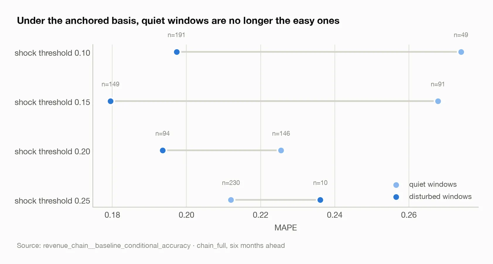
At every threshold but the strictest, the quiet windows score worse than the disturbed ones. The last row has ten disturbed forecasts and should not be read as a reversal of the pattern.
So the property I had been most attached to — “it holds to a few percent while conditions hold” — belongs to the anchor, not to cohort modelling in general. A studio that wants a quarter-ahead baseline to plan against and one that wants a defensible annual number are asking for different estimators. I can now measure that difference rather than assert it, which is better than where I started, but it is not the tidy result I wanted.
Old cohorts vanished silently until I noticed. Cohorts installed before the KPI window had no observed age zero, so a survival basis dropped them without a warning, producing a flat under-forecast. The pooled tail exists because of this. Pooling those cohorts into one calendar series and extrapolating it was far worse: the experienced-player pool is still filling, so the extrapolation explodes.
What the estimates actually say
The chain wins where it matters and loses where it does not. Mean MAPE by
horizon over forty origins (revenue_chain__revenue_chain_accuracy): the chain
scores 0.228, 0.207, 0.213 and 0.300 at one, three, six and twelve months; the
drift line 0.199, 0.290, 0.397 and 0.668; last-month-held-flat 0.168, 0.305,
0.502 and 0.886.
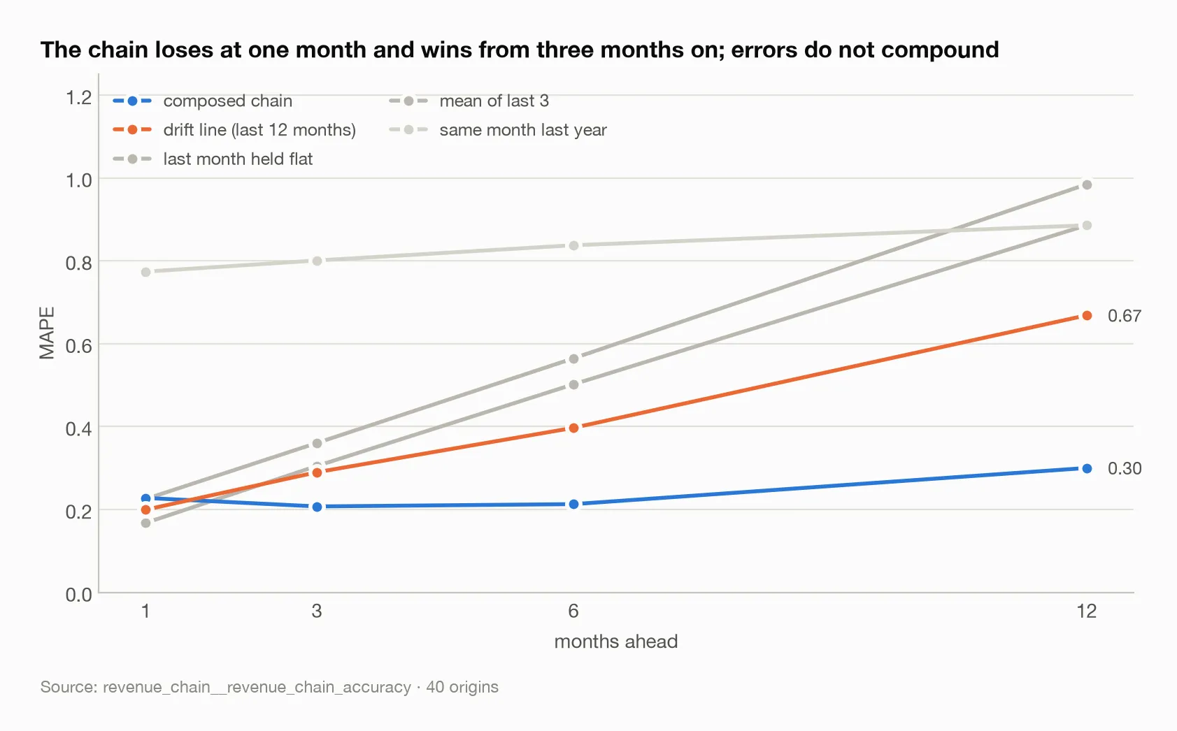
Every baseline’s error climbs with horizon. The chain’s is nearly flat to six months, because each cohort age is anchored independently rather than chained from the previous forecast.
One month out the chain is beaten by both a drift line and carrying the last value forward. It anchors each cohort on its first month, so it discards the most recent thing it knows — which at one month ahead is almost everything that matters. At three and six months it is decisively ahead, roughly half the drift line’s error. At twelve it is under half. Errors do not compound, because every age is anchored independently.
The bias changes sign with horizon. On the calendar-term script’s origins,
the chain runs at −0.174 one month out, −0.141 at three, −0.076 at six and
+0.185 at twelve (calendar_term__calendar_term, none row). That is a much
smaller error than the compounding over-projection it replaced, and a harder
shape to correct.
Perfect install knowledge barely helps. Feeding the chain actual post-origin cohort sizes instead of forecast ones moves the mean from 0.237 to 0.242 — no improvement at all on average, and none at short horizons. The cohort curves, not the UA forecast, are the binding constraint.
Direction is easier than level. The chain calls the sign of the change
correctly 65% of the time one month out, 77.5% at three, 95% at six and 92.5%
at twelve, against 42.5%, 52.5%, 67.5% and 87.5% for the drift line, on forty
forecasts each (revenue_chain__revenue_direction_accuracy). Restricted to
material moves the figures are slightly higher.
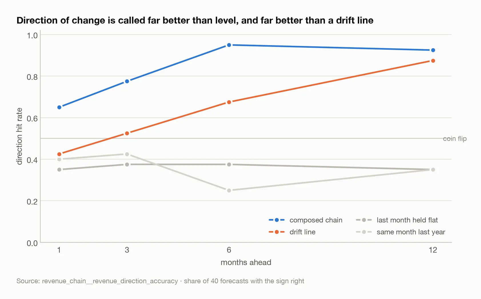
The drift line converges on the chain at twelve months because, over a year, the direction of a decaying game is mostly down and a trend line eventually says so. The chain says so from three months.
It calls declines and misses recoveries. Of four turning points in the
panel, every chain variant called both troughs and missed both peaks; the only
variant to catch a peak was the one fed actual install counts
(revenue_chain__turning_point_calls). This is what a decay process should do.
Cohort ageing can only bend downward. An upturn requires new cohorts, and new
cohorts are a UA-plan input, not something a model discovers. Predicting an
upturn is a planning question.
What I would change next time
A horizon-dependent basis. Two independent measurements now point the same way: chain the decay for the first one to three steps, where the latest observation is worth the most, and hand over to anchored survival beyond, where compounding does the most damage. It would recover the near-horizon accuracy and probably the quiet-window property without giving up the long-horizon gain. It changes the shipped default, so I have left it as a decision rather than a fix.
Score the baseline against the plan, not the actuals. The shock definition is symmetric — any large month-over-month move counts. A plan-aware version would separate adverse shocks from interventions that worked. The second is the plan beating the baseline and arguably should not count as forecast error at all.
Delegate, do not reimplement. The basis mismatch existed because the composition layer reimplemented cohort ageing instead of calling the model. A composer that wraps a model will drift from it. This is an engineering lesson, but it cost me two findings.
The broader lesson
The single most important number in this essay is not an error rate. It is the fact that supplying perfect install forecasts changed nothing. I had assumed, without measuring, that the acquisition stage was where the composition’s error lived, because acquisition is where the uncertainty feels largest. It was not. The cohort curves were the constraint, and attribution — substituting one stage’s actuals at a time — is what said so.
The second lesson is less comfortable. Every stage passed its own test, and the composition still ran the wrong model for weeks. Validating components is necessary. It is not sufficient, and the failure mode is not that the composition scores badly — it is that the composition scores plausibly on a model nobody selected.
And the reversal of the quiet-window property taught me to be careful about which properties I fall in love with. I liked that result because it matched my own practice. It was true of a model I had not chosen, for a reason I had not understood. A forecast’s virtues, like its errors, have causes, and it is worth knowing which piece of the machinery each one belongs to.
Sources
Every figure above traces to one of these tables:
revenue_chain__stage_model_bakeoff— per-metric specification and errorrevenue_chain__revenue_chain_accuracy— composed MAPE by variant and horizonrevenue_chain__baseline_conditional_accuracy— quiet versus disturbed windowsrevenue_chain__revenue_direction_accuracy— direction-of-change hit ratesrevenue_chain__turning_point_calls— the four turning pointscalendar_term__calendar_term— the chain’s bias by horizon (nonerow)