
Game analytics · Part 05 of 8 · August 24, 2026
Where the Uncertainty Actually Was
Written to a disclosure policy: errors, rankings, biases and coverage are reported as measured; totals, prices and dates finer than a year are withheld, and the two titles are pseudonyms. Every figure traces to a named table, listed at the end.
The question
Every stage of the forecasting chain shipped a prediction interval. The composed forecast — the total monthly revenue number a studio would actually plan against — shipped none. It was a point estimate with a MAPE attached, and a MAPE is a statement about the past, not about how wrong the next forecast might be.
I wanted to build the band properly, and I had a specific worry. The intervals I had been shipping elsewhere in the study were empirical: take the historical distribution of relative errors, read off quantiles, apply them as multipliers. It is the default method in most forecasting stacks and I had never checked whether mine covered what they claimed. Stacking those per-stage bands would not have answered the question either, because stage errors are correlated with each other and across cohorts, and compounding independent intervals gives a band that is both too wide and wrong.
So the question was: what is a composed cohort forecast actually uncertain about, and does a properly built band say the same thing as the one I had?
Why the uncertainty is harder to see than the error
An error is one number per forecast. Uncertainty has structure, and the structure is what matters for a sum.
Total revenue in a month is a sum over every cohort alive in it. If each cohort’s error is independent of the others, then the sum’s relative uncertainty shrinks with the number of cohorts — roughly by the square root of their count. Sixty cohorts, and the aggregate band is nearly eight times tighter than any one cohort’s. That is the arithmetic a two-way cohort model performs by default, and it is correct for independent noise.
But some things move every cohort at once. A promotion, a seasonal dip, a platform policy change, a live-ops event: these hit the whole live population in the same month, and a component that is common to all sixty cohorts does not shrink when you add them up. It does not shrink at all. A model that treats each cell’s noise as independent will therefore understate the aggregate band by exactly the share of variance that is shared, and the understatement gets worse the more cohorts you sum.
I did not know, going in, how large that shared component was. Four earlier investigations in this study had all tried to improve the cohort curves — a per-age trend, a pooled quality drift, a second-account validation, a mix-conditioned model — on the implicit assumption that the cohort curves were where the uncertainty lived. Nobody, including me, had measured whether that was true.
My approach
A hierarchical model on revenue per install, on logs:
log rpi(c, n) = mu(n) + gamma(c) + eps
eps ~ N(0, sigma²),   gamma(c) ~ N(0, tau²)
mu(n) is the shared age profile — what a typical cohort does at age n.
gamma(c) is cohort quality: how much better or worse cohort c is than
typical, at every age. sigma is within-cohort noise. tau is how much cohorts
differ from each other. Modelling per install rather than total revenue keeps
cohort size with the install forecast instead of double-counting it.
This is not a new decomposition. The study already fitted exactly this by
two-way means elsewhere, and the recency-weighted estimator shrinks toward a
pooled mean by hand with a fixed prior strength. Making it Bayesian adds two
things. The pooling strength tau is estimated from the data rather than
assumed. And there is a posterior predictive, which is the actual point.
The posterior predictive matters because of an asymmetry. A cohort observed
before the origin has a posterior for its own gamma; its band reflects
estimated quality plus noise. A cohort acquired after the origin has never
been observed, so its quality can only be drawn from the population distribution
N(0, tau²). That produces an honestly wide band for precisely the cohorts the
bias decomposition had identified as carrying most of the long-horizon error —
and which the point forecast treats as average. The point forecast assumes new
cohorts are typical; the posterior predictive says how wrong that can be.
On logs this is a Gaussian two-way random-effects model, which is conjugate, so a short Gibbs sampler in plain numpy suffices and is fast enough to refit at every one of forty backtest origins. A general-purpose probabilistic programming framework would have bought nothing here.
The shared calendar shock is estimated from the residual structure the two-way model leaves behind — the part of a month’s error that is common across every cohort alive in it. Then the composition is rerun with one source of uncertainty switched on at a time, so the width of the band can be attributed rather than argued about.
The assumptions doing the heavy lifting
Cohort quality is a single number per cohort. gamma(c) shifts a cohort’s
whole curve up or down; it does not change its shape. The second-title work on
cohort drift suggests that on at least one game quality is partly a shape
effect. The model does not capture that.
Near-flat priors on the variances. This is not a formality. An
Inverse-Gamma(2, 1) prior on the variance components has prior mean 1, which on
a few dozen cohorts drags tau upward by a large fraction. That is a strong
opinion about the quantity being measured, smuggled in as a default. The
parameter-recovery tests caught it; inspection did not.
gamma is recentred every sweep. mu(n) + gamma(c) is additively
ambiguous — a constant can drift between the two — and without recentring the
decomposition is unidentified and the sampler wanders. Also caught by recovery,
not by inspection. Both of these produce plausible-looking output, which is why
I would not trust a sampler I had not fed known parameters.
Zeros are missing, not modelled. About 14% of cells in the revenue matrix are zero. I had scoped a hurdle model for them. Measuring where they are removed the need: ages 0 to 18 have essentially no zero cells and carry the large majority of revenue; the zeros are a deep-tail artifact of tiny, long-dead cohorts. Masked, with ages that have too few positive observations excluded outright, the posterior for those ages widens on its own — which is correct behaviour and needs no special case. Measure where the awkward cells are before building machinery for them.
Where reality became inconvenient
The first band badly under-covered, and the reason was the point of the whole exercise. Treating each cell’s noise as independent let a sum of sixty cohorts shrink the band by roughly the square root of sixty. Around 30% of the residual variance turned out to be a common monthly component, which shrinks not at all. Adding the shared shock term fixed the coverage. It also changed what I thought the project was about.
The band is far too wide at short horizons. At one month ahead the model draws a fresh, unconditioned calendar shock, while the chain’s point forecast has effectively already seen last month. The result is a one-month band far wider than the one-month error justifies. An autoregressive structure on the shock would tighten it; that is the clear next step and it remains untested. It is a different object from the point forecast’s calendar correction, which was tested and found to have no dynamics — the band and the point are not the same thing, and I have been careful not to let one result speak for the other.
The band does not rescue the twelve-month forecast. Coverage at that horizon is poor for every band, because the point forecast is biased there. No interval rescues a forecast centred in the wrong place. This is the model’s own prediction, and it converts “do not plan a year ahead with this” from an assertion into a measurement.
What the estimates actually say
The band I had been shipping was sharp and wrong. At a nominal 80% level,
across forty origins and all horizons, the empirical band covers 60.8% of
actuals at a relative width of 0.31; the posterior predictive band on the
chain’s point forecast covers 84.5% at a width of 0.83
(posterior_band__band_scores_overall).
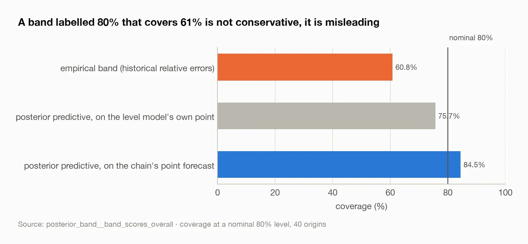
The vertical line is the nominal level. The empirical band — the default method — is nearly twenty points short of it; the posterior band on the chain’s point forecast clears it.
A band labelled 80% that contains the truth 61% of the time is not conservative. It is misleading. And the sharp empirical band is what most forecasting stacks reach for by default, mine included. That is the most immediately actionable result in this essay. The posterior band is honest and considerably wider; an interval score that rewards narrowness prefers the sharp one, and a team that plans against a stated confidence level should not.
By horizon (posterior_band__band_scores), the posterior band on the chain
covers 100% at one and three months — too wide, as above — 83.8% at six, and
54.1% at twelve. The empirical band sits between 56.8% and 64.9% at every
horizon. The twelve-month row is not a failure of the band; it is the bias
showing through.
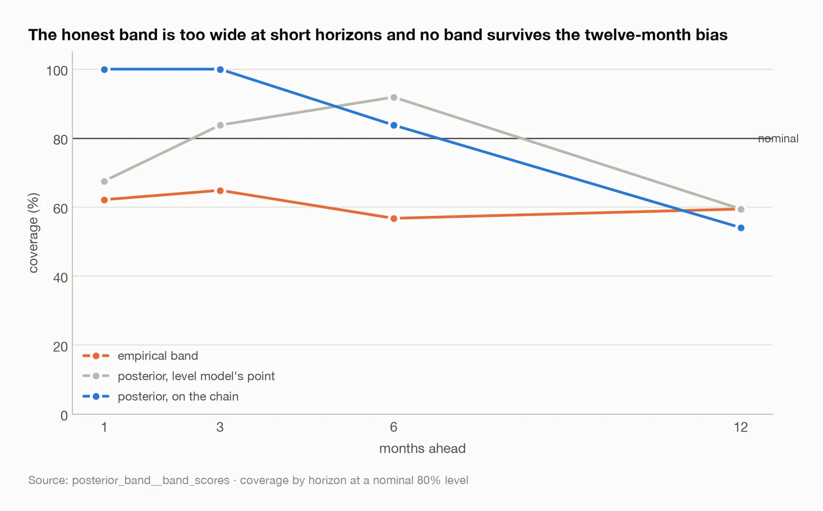
The blue line covering everything at one and three months is the unconditioned calendar shock making the band wider than the short-horizon error justifies. All three bands converge on the same poor coverage at twelve months, where the point forecast is biased and no width helps.
The finding that outranks the band. Rerunning the composition with one
source of uncertainty at a time attributes the band’s width
(posterior_band__band_width_by_source). At one month ahead, cohort behaviour
alone produces a relative width of 0.19, the install forecast alone 0.30, the
calendar shock alone 0.65, and all three together 0.72.
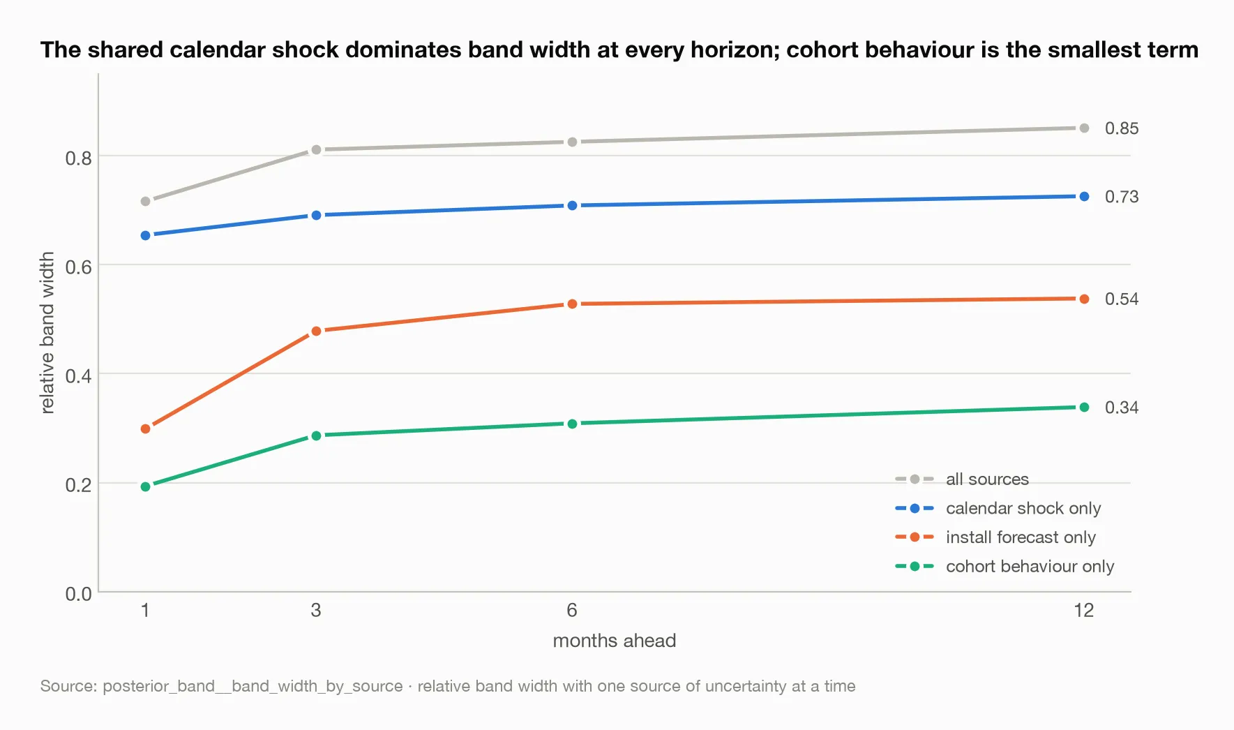
The calendar-shock line alone accounts for most of the full band at every horizon. The install forecast grows fastest with horizon and is the second lever. The cohort line — the thing four investigations had tried to improve — is the lowest on the chart throughout.
The shared calendar-month shock dominates at every horizon, and cohort uncertainty — the thing a cohort model exists to capture — is the smallest contributor throughout. The install forecast is second and grows fastest with horizon, roughly doubling across the table, but the shock remains the largest term even at a year.
This inverts the assumption the work had been running on. Long-horizon revenue is not uncertain mainly because cohort behaviour is hard to predict. It is uncertain because live-ops, seasonality and platform events move every cohort alive in a month together, and no amount of cohort modelling reduces that.
What I would change next time
Condition the shock. An AR(1) on the calendar component, so a band at one month ahead knows what last month did. Cheap, and it addresses the one place the honest band is embarrassingly wide.
Re-measure every empirical band in the study. The CPI and LTV bands were built the same way as the one that covered 61%. I have no reason to think they are better and one strong reason to check.
Let quality have a shape. A gamma that varies with age, or a second
random effect on the decay rate, would let the model describe the second title,
where cohorts arrive at their predecessors’ level and then decay faster.
Treat the live-ops calendar as an input. The dominant source of uncertainty is a shock that the studio partly schedules. A model that knew the promotion calendar would not be forecasting the shock; it would be reading it.
The broader lesson
I built a band and found a compass. The band was worth having — it showed that my default intervals were off by nearly twenty points of coverage, and I would not have believed that without measuring it. But the decomposition is what reframed the project. Four investigations had aimed at the cohort curves, and the cohort curves were the smallest of three variance components. The ceiling on composed accuracy was never where the effort was going.
The general version: decompose the uncertainty before optimising the model. One afternoon of attribution redirected work that four studies had aimed at the wrong term. And check coverage before trusting an interval. A confidence level is a claim, and a claim you have never tested is a hope with a percentage sign on it.
Sources
Every figure above traces to one of these tables:
posterior_band__band_scores_overall— coverage and width at nominal 80%posterior_band__band_scores— the same by horizonposterior_band__band_width_by_source— one uncertainty source at a time